top of page

WE ARE ALWAYS
NECESSARY BEINGS.
THE TOOLKIT
OF EVERYTHING WE NEED.
INTERIOR / FURNITURE /
IT DEVICE / FINISHING MATERIAL TOOLKIT
CREATIVE DIRECTION
D.BRONZE
UI | UX | GUI
Project Management - D.BRONZE
UI | UX Design - D.BRONZE
Icon Design - D.BRONZE
PROJECT
COMMAX WallPad UI | UX Design
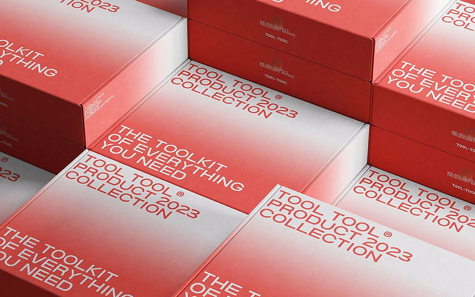
THE TOOLKIT OF
EVERYTHING YOU NEED
TOOL TOOL®
OVERVIEW
TOOL TOOL은 차별성 있는 아이덴티티로 모두에게 쉽게 다가갈 수 있고 하나의 패션아이템으로 접근 가능하도록 브랜딩 설계를 하였습니다.
기존의 장비 브랜드들은 대부분 러기드한 이미지를 가지고 있었습니다. TOOLTOOL은 언제나 가정에서 필요한 장비 브랜드로 기존의 브랜드들과의 차별성과 부드러운 느낌 친근하고 안전한 이미지로 브랜딩 하였습니다.
TOOL TOOL has designed its branding to be easily approachable for everyone with a distinctive identity and accessible as a single fashion item. Most existing equipment brands had a rugged image. TOOLTOOL differentiated itself from other brands by creating a soft, friendly, and safe image as a brand that provides equipment necessary for everyday use at home.
BRAND IDENTITY

1.
STAND OUT
With a focus on safety, we aimed to create a noticeable branding that allows for quick and easy finding and usage from anywhere.
안전성을 챙기며서 어디서�든 빠르게 찾아 사용할 수 있도록 눈에 띄는 브랜딩

2.
GOOD INFLUENCE
We are a necessary presence and we must come out into the world. Our goal is to establish a fresh and positive image that resonates globally.
TOOLTOOL을 통해 좋은 영향력을 행사할 수 있는 브랜딩

4.
SUSTAINABLE DESIGN
To achieve sustainable design, branding that reduces waste from printed materials or packaging.
지속가능한 디자인을 위해 인쇄물이나 패키지의 폐기물을 줄일 수 있는 브랜딩

3.
HARMONY
Branding with a harmonious fit to the surrounding environment, yet with a sense of precise sophistication.
주변 환경에 조화롭게 어울리지만 정확한 시인성을 가진 느낌의 브랜딩

THE TOOLKIT OF
EVERYTHING WE NEED
/ WE ARE ALWAYS NECESSARY BEINGS
우리의 삶에 도움이 되는 모든 도구들은 항상 필요한 존재이며 우리의 삶, 주변에 녹아있습니다. 도구는 우리의 창조성과 실용성을 함께 이룰 수 있는 수단이며 삶에 필요한 것들을 만들거나 개선하는 과정에서 우리의 능력을 확장시켜 주기도 합니다. 도구들은 마치 미래의 비밀을 품고 있는 보물 상자와도 같습니다. 그들은 우리가 무엇을 할 수 있는지, 어떤 방향으로 나아갈 수 있는지를 보여주며, 우리의 꿈과 목표를 현실로 만들어주는 데 도움을 줍니다. 따라서 우리는 늘 도구들을 소중하게 활용함으로써, 우리의 삶을 더욱 풍요롭고 의미 있게 만들어 나갈 수 있습니다.
All the tools that aid our lives are constantly essential presences and are integrated into our lives and surroundings. Tools serve as a means to combine our creativity and practicality, expanding our abilities as we create or enhance the necessities of life. These tools are akin to treasure chests harboring secrets of the future. They showcase what we can achieve and guide us towards directions to realize our dreams and aspirations, transforming them into reality. Hence, by always valuing and utilizing these tools, we can enrich and give deeper meaning to our lives.
BRAND VISION

BRAND COREVALUE
WE ARE ALWAYS NECESSARY BEINGS
THE CORE VALUE OF THE TOOLTOOL BRAND IS TO RECOGNIZE DIVERSITY.
IT IS ABOUT SAFELY REVEALING TOOLS THAT DON'T NEED TO BE HIDDEN,
TOOLS WHOSE EXISTENCE IS NOBLE,
AND TOOLS THAT WE CAN ALWAYS SEE IN OUR ORDINARY DAILY LIFE,
WITHOUT CONCEALING THEM.
TOOL TOOL®
BRAND LOGO

BRAND LOGO
툴에 포함된 가장 기본적인 장비들을 형상화하여 로고 디자인 작업을 진행했습니다. 부드러운 곡선을 통해 장비의 딱딱하고 위험한 이미지를 조화롭게 만들었으며, 직관적인 로고 이미지와 선명한 레드 컬러를 사용하여 브랜드를 쉽게 인식할 수 있도록 했습니다. 높은 채도의 레드 컬러는 시인성을 높여줍니다. 브랜드에 접근하기 쉽고 친근한 분위기를 조성하기 위해 스포티함과 젊은 감각을 나타내는 레드 컬러를 선택했습니다.
We conducted logo design work by visualizing the basic equipment included in the tool. Through smooth curves, we harmoniously transformed the rigid and hazardous image of the equipment. We used an intuitive logo image and vibrant red color to ensure easy brand recognition. The high saturation of the red color enhances visibility and creates an approachable and friendly atmosphere for the brand. We specifically chose a red color that conveys sportiness and a youthful sense to make the brand easily accessible and appealing to everyone.
BRAND SLOGAN


BRAND COREVALUE
1.
STAND OUT
We aimed for prominent branding that ensures safety and allows for quick finding and usage from anywhere.
안전성을 챙기며서 어디서든 빠르게 찾아 사용할 수 있도록 눈에 띄는 브랜딩
2.
GOOD INFLUENCE
We are a necessary presence and we must come out into the world. We aim to build a new positive image that can raise discussions in the world.
안전성을 챙기며서 어디서든 빠르게 찾아 사용할 수 있도록 눈에 띄는 브랜딩
3.
HARMONY
Branding with a harmonious fit to the surrounding environment, yet with a sense of precise sophistication.
주변 환경에 조화롭게 어울리지만 정확한 시인성을 가진 느낌의 브랜딩
4.
FRIENDLY AREA
We aimed for prominent branding that ensures safety and allows for quick finding and usage from anywhere.
안전성을 챙기며서 어디서든 빠르게 찾아 사용할 수 있도록 눈에 띄는 브랜딩
( Main Slogan )
( Sub Slogan )
WE ARE ALWAYS
NECESSARY BEINGS
BRAND ESSENCE
“WE ARE ALWAYS NECESSARY BEINGS.”
TOOLTOOL focuses on customer needs and provides essential services and products.
It conveys the message of always prioritizing consumers
and their demands and needs.
TOOLTOOL의 브랜드 에센스를 “WE ARE ALWAYS NECESSARY BEINGS.” 으로 정의합니다.
TOOLTOOL은 고객들의 필요에 집중하며, 필수적인 서비스나 제품을 제공합니다.
“항상 필요한 존재” 로서 소비자를 존중하고 그들의 필요를 가치 있게 여기는 것이 TOOLTOOL의 가치 입니다.
또한 고객들은 제품을 넘어 신뢰성을 제공받고 있다는 메세지를 받게 됩니다. 소비자들이 비즈니스나 브랜드를 믿고 의지할 때, 특별한 관계를 형성하게 되는 의미를 내포하는 브랜드 에센스 입니다.
We define the brand essence of TOOLTOOL as "WE ARE ALWAYS NECESSARY BEINGS." TOOLTOOL focuses on the needs of customers and provides essential services or products. Respecting consumers as "always necessary beings" and valuing their needs is the core value of TOOLTOOL. Additionally, customers receive a message that they are receiving reliability beyond just products. This brand essence embodies the significance of forming a special relationship when consumers trust and rely on a business or brand.
.jpg)
BRAND LOGO

Main Slogan.
"우리는 언제나 필요한 존재입니다"
우리가 보거나 경험하는 모든 것들은 형태의 가치나 기능을 가지고 있으며, 아주 사소하고 작은 것일지라도 그 모든 것들은 고유한 기능을 하거나 상호작용을 통해 중요한 역할 수 있다는 의미를 내포하고 있습니다.
이는 모든 사람과 사물간의 관계, 그리고 모든 사람들과의 관계에 포함되는 문장입니다. 인간은 서로의 도움을 주고, 또 그 도움을 받으며 사회를 구성하고 문화를 형성해 나갑니다.
또한 사물의 도움으로 부터 상호작용을 해 나가며 우리를 둘러싸고 있는 사회를 건설해 나갑니다.
TOOLTOOL 브랜드의 슬로건은 사물과 사람의 모든 관계에 통용되는 중의적인 슬로건을 통해 모든 것들의 소중함을 알리고 있습니다.
"We are always necessary beings." Everything we see or experience possesses a form of value or functionality, and even the most trivial and small things can serve a unique purpose or play a significant role through interaction. This statement encompasses all relationships between people and objects, as well as among all individuals. Humans provide assistance to one another, receive help in return, construct societies, and shape cultures. Additionally, we progress through interactions aided by objects, building the society that surrounds us. TOOLTOOL brand's slogan aims to communicate the universality of relationships between objects and people, highlighting the preciousness of all things.
COLOR SYSTEM

Sub Slogan.
TOOL TOOL 브랜드의 광고 마케팅에 사용되는 한글 슬로건을 입니다.
직관적으로 TOOL TOOL 브랜드가 판매하는 제품군을 보여주는 슬로건으로 소비자에게 해당 상품 또는 서비스의 중요성을 인식시키고 이를 기억하게 하기 위함입니다.
브랜드의 미션, 가치, 사회적 책임을 전달하기 위해 메인슬로건과 함께 캐쥬얼한 서브슬로건을 함께 사용합니다.
The Korean slogan for TOOL TOOL brand in advertising and marketing is designed to be intuitive, showcasing the range of products offered by TOOL TOOL in a way that makes consumers recognize the importance of the products or services and remember them. In addition to the main slogan, a casual sub-slogan is used to convey the brand's mission, values, and social responsibility.

MAIN COLOR
RGB 225/36/23
CMYK 0/98/93/0%
#FF2417
SUB COLOR
RGB 117/11/6
CMYK 51/100/100/34%
#750b06
SUB COLOR
RGB 255/255/255
CMYK 0/0/0/0%
#ffffff
GRADIENT
COLOR SYSTEM
#FF2417
GRADIENT
COLOR SYSTEM
#750b06
TYPOGRAPHY SYSTEM


TOOL TOOL®
GRID SYSTEM


TOOL TOOL®
2D PICTOGRAM
THE TOOLKIT OF
EVERYTHING WE NEED
/ WE ARE ALWAYS NECESSARY BEINGS
-01.jpg)
-02.jpg)
-03.jpg)

WE ARE ALWAYS
NECESSARY BEINGS.
/
"THE TOOLKIT
OF EVERYTHING YOU NEED"
/
TOOL KIT
POWER DRILL
KIT SCREW
TOOL KIT
TOOL TOOL®
TOOL TOOL®
3D PICTOGRAM
APP과 마케팅, 오프라인 인테리어, 가상공간 쇼룸인 VBS* 에 사용될 TOOL TOOL 의 3D PICTOGRAM 입니다.
오프라인 공간의 SIGNAGE에도 사용이 되는 PICTOGRAM으로 TOOLTOOL의 아이덴티티의 연계성을 반영한 소재를 적용한 3D PICTOGRAM 입니다.
TOOLTOOL의 메인컬러를 적용한 불투명 아크릴 소재와 알루미늄 서스 소재를 사용하여 PICTOGRAM을 사용합니다.
This is a 3D PICTOGRAM for TOOL TOOL, which will be used for APP and marketing, offline interior, and virtual space showroom, VBS*.
This 3D PICTOGRAM is designed to be used in offline space signage, reflecting the coherence of TOOL TOOL's identity through the use of materials. It incorporates the main colors of TOOL TOOL and utilizes opaque acrylic and aluminum source material for the PICTOGRAM.
3D
PICTOGRAM


PICTOGRAM & SIGNAGE SYSTEM

PICTOGRAM & SIGNAGE SYSTEM
APP & WEB DESIGN


.jpg)


APPLICATION DESIGN
3D 포스터 (피스나 카라비너 돌아가는) | 멤버십 카드 돌아가는
-> 전체적인 톤 정리, 톤 비슷하게 돌아가게


.jpg)
%20(1).jpg)


CREATIVE DIRECTION
D.BRONZE
Branding
UI | UX | GUI Design
Project Management
Icon Design
Application Design
PROJECT
TOOL TOOL® Branding | UI/UX | Application Design
BRAND MISSION

BRAND LOGO
GRID SYSTEM

bottom of page