top of page

CREATIVE DIRECTION
D.BRONZE
UI | UX | GUI
Project Management - D.BRONZE
UI | UX Design - D.BRONZE
Icon Design - D.BRONZE
PROJECT
COMMAX WallPad UI | UX Design
.png)
CREATIVE DIRECTION
D.BRONZE
Branding
UI | UX | GUI Design
Project Management
Icon Design
Application Design
PROJECT
FOFOF Furniture Branding
CREATIVE DIRECTION
D.BRONZE
Brand Consulting
Total Branding
Icon Design
Application Design
Web Design
PROJECT
FOFOF Furniture Branding


OVERVIEW
FOFOF is a modern furniture brand inspired by the principles of Bauhaus design. Rooted in the core philosophy that “form follows function,” FOFOF offers furniture that maximizes utility and practicality. Each piece blends seamlessly into any space, enhancing its aesthetic harmony, and is the perfect choice for those who seek a minimalist and sophisticated lifestyle.
FOFOF는 바우하우스 기반의 모던 스타일 가구를 선보이는 브랜드입니다. '형태는 기능을 따른다'는 바우하우스의 핵심 원칙을 바탕으로 기능성과 실용성을 극대화한 가구를 제안합니다. 어느 공간에나 자연스럽게 어우러져 공간의 미학을 완성하며, 미니멀하고 세련된 라이프스타일을 추구하는 이들을 위한 최적의 선택이 될 것입니다.


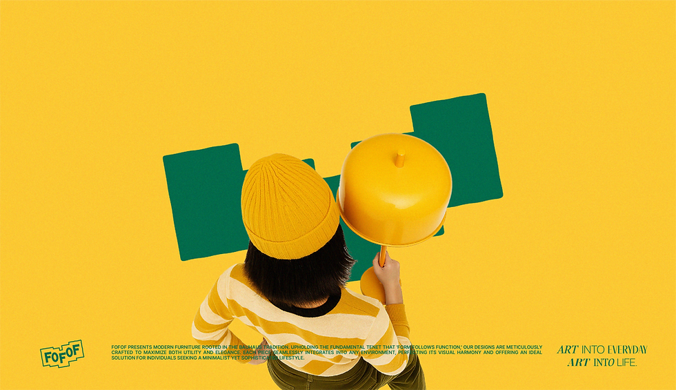
BRAND FEATURE
Not art to be merely admired like a distant shoreline, but beauty with purpose that lives within our spaces. Furniture that combines aesthetics and function becomes part of our daily lives, turning the everyday into something artistic. True art is accessible and meaningful to everyone. That is what makes it real.
바라보기만 하는 예술이 아닌, 공간 속에서 쓰임을 갖는 아름다움. 심미성과 기능을 겸비한 가구들이 일상에 스며들며, 우리의 매일은 자연스럽게 예술이 됩니다. 누구나 쉽게 다가설 수 있는 예술, 그것이야말로 진짜 예술입니다.
BRAND COREVALUE
① Everyday Joy ② A colorful accent ③ Concenience
바라보기만 하는 예술이 아닌, 공간 속에서 쓰임을 갖는 아름다움. 심미성과 기능을 겸비한 가구들이 일상에 스며들며, 우리의 매일은 자연스럽게 예술이 됩니다. 누구나 쉽게 다가설 수 있는 예술, 그것이��야말로 진짜 예술입니다.
① Everyday Joy
② A colorful accent
③ Concenience
BRAND COREVALUE
① Everyday Joy ② A colorful accent ③ Concenience
BRAND COREVALUE
① Everyday Joy ② A colorful accent ③ Concenience
바라보기만 하는 예술이 아닌, 공간 속에서 쓰임을 갖는 아름다움. 심미성과 기능을 겸비한 가구들이 일상에 스며들며, 우리의 매일은 자연스럽게 예술이 됩니다. 누구나 쉽게 다가설 수 있는 예술, 그것이야말로 진짜 예술입니다.
① Everyday Joy
② A colorful accent
③ Concenience
BRAND FEATURE
Not art to be merely admired like a distant shoreline, but beauty with purpose that lives within our spaces. Furniture that combines aesthetics and function becomes part of our daily lives, turning the everyday into something artistic. True art is accessible and meaningful to everyone. That is what makes it real.
바라보기만 하는 예술이 아닌, 공간 속에서 쓰임을 갖는 아름다움. 심미성과 기능을 겸비한 가구들이 일상에 스며들며, 우리의 매일은 자연스럽게 예술이 됩니다. 누구나 쉽게 다가설 수 있는 예술, 그것이야말로 진짜 예술입니다.
BRAND COREVALUE
① Everyday Joy ② A colorful accent ③ Concenience
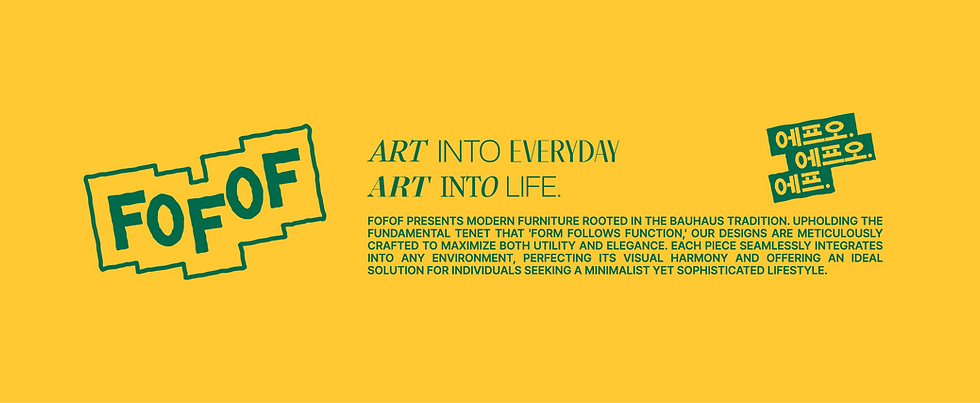
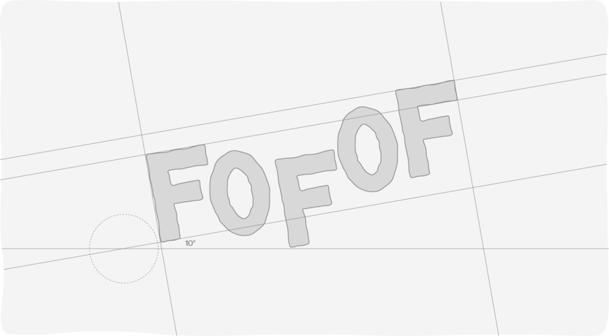
BRAND ESSENCE


BRAND LOGO
FOFOF is grounded in the principle of “Form follows function,” blending efficiency and beauty within simple, balanced forms. Through minimal changes, it delivers bold and clear functionality, while intentionally off-kilter proportions add a sense of wit and inviting ease. FOFOF’s design philosophy is visually expressed through practical, refined forms that achieve maximum aesthetic impact—and a design language that anyone can relate to.
FOFOF는 ‘Form follows function’이라는 원칙을 바탕으로, 단순한 형태 안에 효율성과 아름다움을 균형 있게 담아냈습니다. 최소한의 변화로 강렬하고 명확한 효율성을 전달하며, 의도적으로 비튼 균형감을 통해 위트와 누구나 쉽게 바라볼 수 있는 편안함을 더했습니다. 실용성과 절제된 형태적 표현을 통한 최대의 미감, 그리고 누구나 공감할 수 있는 디자인 언어는 FOFOF의 철학을 시각적으로 표현했습니다.

.png)


BRAND ASSET MOTIF
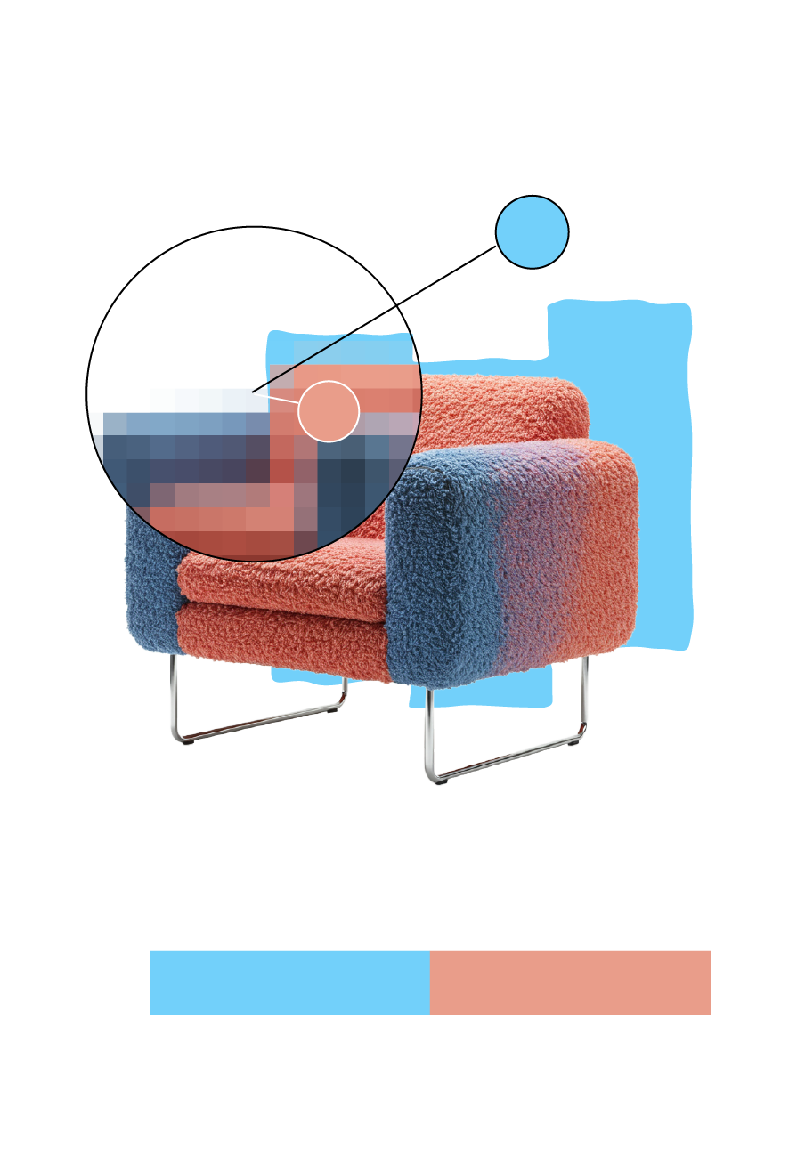
FOFOF’s products are based on a form composed of three offset box-like volumes arranged in different directions. This composition was intentionally designed as a structural and visual device to guide the viewer’s gaze while maintaining an overall sense of balance. The resulting asymmetry adds subtle visual tension within the harmony, reflecting FOFOF’s core design philosophy “tension within simplicity.”
FOFOF의 제품은 세 개의 박스가 각기 다른 방향으로 어긋나게 배치된 형태를 만들었습니다. 구조적 균형과 시선을 유도하는 에셋으로 계획하였으며, 전체적으로 조화를 이루지만 미묘한 비대칭으로 시선을 유도하는 조형요소를 의도하였습니다. 이러한 디자인 언어는 FOFOF가 추구하는 ‘단순함 속의 긴장감’을 반영합니다.

BRAND COLOR
FOFOF’s brand design is a contemporary reinterpretation of the Bauhaus spirit of functionalism. Inspired by the colors of its products, the brand adopts a vivid and pop-infused color palette as its core identity. By applying a triadic color system—anchored in the main product hue and designed to create both striking contrast and visual harmony—the background composition enhances the presence of each product while reinforcing the clarity of the brand’s identity.
FOFOF의 브랜드 디자인은 바우하우스의 기능주의 정신을 현대적으로 재해석한 결과물입니다. 제품 컬러로 부터 영감을 받아 선명하고 팝한 컬러 팔레트를 브랜드 컬러로 사용하였습니다. 제품의 메인 컬러를 기준으로 색상 대비가 뚜렷하면서도 조화를 이루는 트라이어딕 컬러(Triadic Colors) 시스템을 백그라운드 컬러 구성에 활용하여, 제품을 돋보이면서 브랜드의 아이덴티티를 보여줄 수 있도록 하였습니다.


%20(1).png)
FOFOF COLOR CHIP
FOFOF
COLOR CHIP

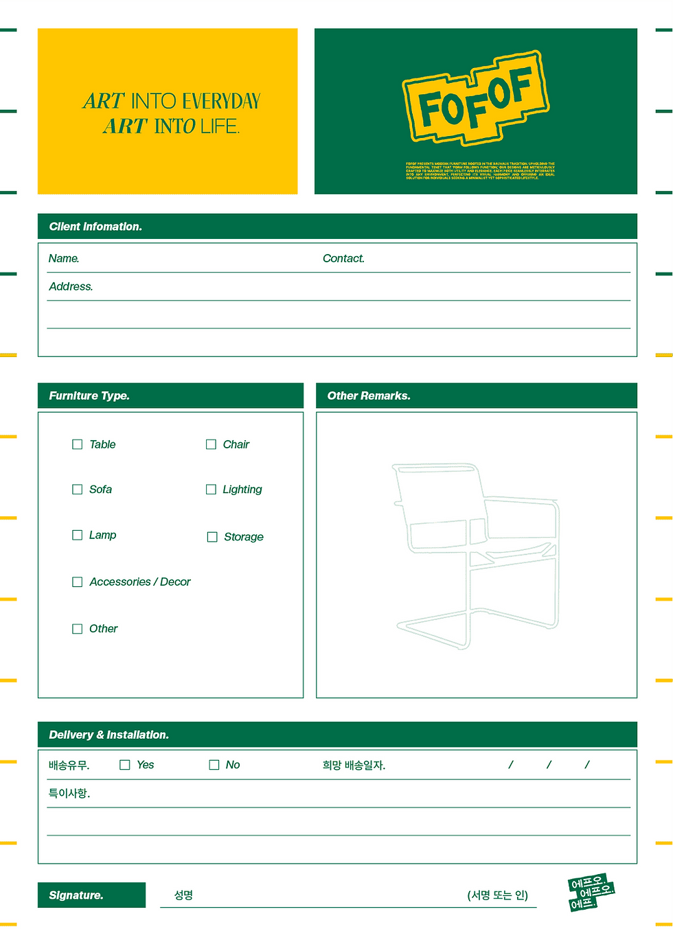
BRAND FONT
FOFOF’s typographic system is a key element in visually expressing the brand’s form and sensibility.
To reflect the organic shapes and vibrant colors present in the products, the selected typefaces embody fluid and refined structures.
For slogans, a mix of three distinct fonts is used to create a bold, free-spirited impression that conveys the brand’s playful and diverse visual language.
In contrast, the body text and informative content employ a consistent typeface to ensure both clarity and a unified brand identity.
FOFOF의 타이포그래피 시스템은 브랜드의 조형성과 감성을 시각적으로 표현하는 중요한 요소입니다. 제품에서 느껴지는 자연스러운 형태와 컬러감을 표현하기 위해 서체들도 유연한 조형미를 가지고 있는 서체를 사용하였습니다. 슬로건에는 3가지 서로 다른 폰트를 믹스해 사용하여 자유롭고 독창적인 이미지를 연출하며, 이는 브랜드가 지향하는 감각적인 다양성을 반영합니다. 반면, 본문 및 정보 전달 목적의 텍스트에는 일관된 서체를 사용하여 브랜드의 정체성과 가독성을 동시에 확보하였습니다.

.png)


FOFOF LABEL SYSTEM
At FOFOF, furniture is seen not merely as physical objects but as a visual language.
Each piece is categorized by color and assigned a distinctive label, allowing customers to intuitively and efficiently find pieces that resonate with their personal taste and spatial aesthetics.
This color-based categorization system reinforces the brand’s identity with clarity and coherence.
FOFOF는 가구를 단순한 물리적 오브제가 아닌 시각적 언어로 바라봅니다. 각 제품의 카테고리를 컬러에 따라 분류하고 고유의 라벨을 부여함으로써, 고객이 자신만의 취향과 공간에 맞는 제품을 빠르고 직관적으로 선택할 수 있도록 돕습니다. 이 컬러 카테고리 시스템은 브랜드의 정체성을 더욱 선명하게 전달합니다.
.png)
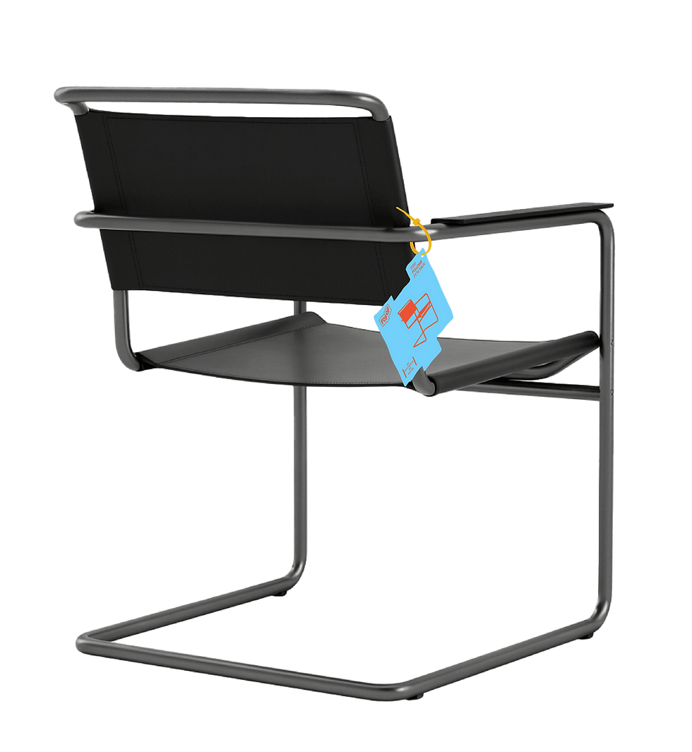
Chair
.png)
Lighting

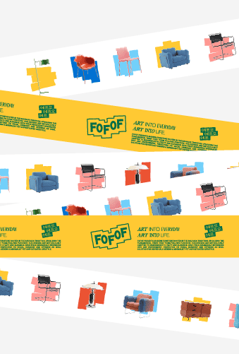
BRAND APPLICATION
Based on FOFOF’s branding, we established a clear and cohesive brand identity, which was then translated into a consistent visual language across all applications.
FOFOF의 브랜딩을 기반으로 명��확한 브랜드 아이덴티티를 확립하고, 이를 바탕으로 다양한 어플리케이션 디자인 전반에 일관된 비주얼 언어를 적용하였습니다.


.png)
.png)


.png)
.png)

%20(1).png)
.png)
%20(1).png)


.png)


.png)

BRAND WEB PAGE
The FOFOF website is designed around delivering a cohesive brand experience.
By consistently applying FOFOF’s identity colors and visual design language, users are immersed in the brand’s unique aesthetic universe. Every element is thoughtfully structured to ensure the brand’s clarity and continuity within the digital environment.
FOFOF의 제품 판매를 위한 웹사이트 디자인은 브랜드 경험을 중심에 둡니다.
일관된 브랜드 아이덴티티 컬러와 비주얼 디자인 언어를 반영하여, 사용자는 FOFOF만의 고유한 브랜드 세계관을 직관적이고 감각적으로 경험할 수 있습니다. 디지털 환경에서도 브랜드의 통일성과 정체성이 자연스럽게 스며들도록 설계되었습니다.


.png)


bottom of page